
To really boost your website's conversion rates, you have to know where you're starting from. It’s all about digging into your current performance to figure out exactly where and why people are leaving before they convert. This process isn't about guesswork; it’s about creating a solid game plan based on real data.
Setting Your Baseline: The First Step in Any CRO Plan
Before you change a single button or rewrite a headline, you need a clear, unfiltered picture of how your website is performing right now. This isn't about vanity metrics like page views. We're talking about the hard numbers that directly connect to your revenue and growth. This initial audit is your foundation—it gives you the data you need to make smart decisions.
Think of it like a doctor running diagnostics before prescribing a treatment. Without this baseline, you're essentially flying blind, making changes that feel right but might have zero actual impact on your goals.
What Metrics Actually Matter?
To get an accurate starting point, you’ll want to focus on a handful of Key Performance Indicators (KPIs) that tell you a story about how people are interacting with your site. These metrics help you pinpoint the weak spots in your conversion funnel.
Here's where I always recommend starting:
- Bounce Rate on Key Pages: A high bounce rate, especially on important landing pages, is a major red flag. It usually means there's a disconnect between what your visitors expected and what they found.
- Conversion Funnel Drop-off: Where are you losing people? Map out your user's journey (e.g., Homepage → Product Page → Cart → Checkout) and see which step has the highest exit rate. A 50% drop-off at the payment step points to a very different issue than a 70% drop-off from the product page.
- Shopping Cart Abandonment Rate: For anyone in e-commerce, this is pure gold. The global average cart abandonment rate is around 70%, so you're not alone. This is often triggered by unexpected shipping costs, a clunky checkout process, or a simple lack of trust.
This initial deep dive helps you stop asking vague questions like "how do we get more sales?" and start tackling specific, solvable problems like, "why are so many people abandoning their cart on the shipping page?"
This simple flow shows how you can turn raw data into real improvements.
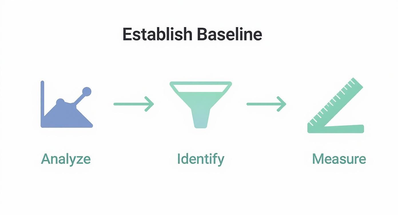
As you can see, it's a cycle: analyze what's happening, find the friction points, and then measure your results. That’s CRO in a nutshell.
A Quick Guide to Core CRO Metrics
To keep things simple, here’s a table of the essential metrics you should be tracking. This is your CRO health check—a quick reference for understanding what’s going on under the hood of your website.
Essential Metrics for Your CRO Health Check
This table isn't exhaustive, but it’s the perfect place to start. Mastering these metrics gives you the language to understand and improve your website's performance.
Tools to Get You Started
You don't need a huge budget to begin. Powerful and often free tools are available to help you gather this critical data. Google Analytics is the undisputed starting point for quantitative data—it’s perfect for tracking user flow and spotting high-exit pages.
A baseline isn’t just a number; it’s the context for every decision you make moving forward. It transforms CRO from a series of random tweaks into a system of measurable, continuous improvement.
But the real magic happens when you blend that quantitative data with qualitative insights. For example, once you see a high drop-off on your checkout page in analytics, you can then use other tools to understand why. Looking at how our customers use data to understand their users has shown me time and again that this combination is key.
This foundational work sets you up to create realistic goals and, just as importantly, lets you prove the value of your optimization efforts to your team or stakeholders.
Finding Out Why Your Visitors Aren’t Converting
Analytics data is great for telling you what is happening. It'll show you the pages with shocking exit rates or the exact spot where your funnel springs a leak. But to really move the needle on conversions, you have to dig deeper and find the why. This means stepping away from the spreadsheets and seeing your website through your visitors' eyes.
This is where qualitative analysis comes in. You're hunting for the friction points, the moments of confusion, and the pure frustration that numbers alone can never show you. It’s the difference between knowing 25% of users drop off at checkout and actually watching them rage-click a broken payment button in real time.
See What Your Users See with Heatmaps
Heatmaps are probably the fastest way to get a visual gut-check on user behavior. They paint a picture of where people are clicking, how they're moving their mouse, and just how far they're bothering to scroll. In an instant, you can see what’s grabbing their attention and, just as importantly, what’s getting completely ignored.
You might find visitors constantly clicking on a cool-looking image that you forgot to link, signaling a missed opportunity or just plain bad design. That's an insight you’d never guess from looking at a bounce rate chart.
Take this heatmap from Hotjar, for example. It shows exactly where users are clicking on a product page.

The bright red and yellow spots show the "Add to Cart" button and product images are getting tons of action—perfect. But you might also spot clicks on text or other elements that aren't interactive, which is a dead giveaway that people are confused.
Watch Real User Journeys with Session Replays
If heatmaps are the 30,000-foot view, session replays are your on-the-ground detective work. These are anonymized recordings of what real people actually did on your site. You get to be a fly on the wall as they land on your homepage, poke around your product pages, and try (or fail) to check out.
It can be a seriously humbling experience. You’ll witness firsthand things like:
- Navigation Nightmares: See someone get completely lost trying to find your return policy, clicking back and forth between two pages in a loop of frustration.
- Form Frustration: Watch a user give up on a form because of a vague error message they can't figure out.
- Mobile Mishaps: Discover that a critical button is nearly impossible to tap on a phone, killing your conversion rate for an entire segment of users.
I’m serious—watching just a handful of session replays from users who abandoned their carts can give you more actionable ideas than staring at analytics charts for a week. You start to feel their pain, and that empathy is what sparks the best solutions.
This direct look turns vague hypotheses into concrete problems. You can stop saying "the checkout is confusing" and start saying, "mobile users can't apply the discount code because the keyboard covers the input field." Now that's a problem you can fix.
The Easiest Way to Get Answers? Just Ask.
Sometimes, the most straightforward way to find out what's wrong is to simply ask your visitors. On-page surveys and little feedback widgets are surprisingly powerful tools for getting answers at the exact moment a problem occurs.
You don't need a 20-question survey. A few smart, well-placed questions can uncover your biggest conversion killers.
A Few Survey Ideas I've Seen Work Wonders:
When you combine these three methods—heatmaps, session replays, and direct feedback—you get the complete story. You have the visual data, the behavioral context, and the customer's own words. This is the trifecta of insight you need to build a conversion optimization plan based on real evidence, not just guesswork.
How to Prioritize Changes for Maximum Impact

So, you've done the deep dive. You've sifted through analytics and watched more session replays than you can count. Now you're probably looking at a long, intimidating list of potential fixes and tests.
The big question is, where do you even start? It’s tempting to grab the low-hanging fruit or the fix that seems easiest, but that's rarely the strategy that moves the needle. Without a system, you'll get bogged down in debates over which idea is "best" or waste time on changes that deliver minimal results.
What you need is a framework. A simple, repeatable process turns that messy list of ideas into a clear, strategic roadmap.
The PIE Framework: Your Prioritization Shortcut
One of the most battle-tested models out there is the PIE framework. It’s brilliant in its simplicity. Instead of relying on gut feelings, it forces you to score every idea against three key criteria: Potential, Importance, and Ease.
You just give each idea a score from 1 to 10 for each category. It’s a quick way to quantify an idea's real value.
Here’s how it works:
- Potential: How much improvement can we realistically expect? Think about the pages with the worst performance. A landing page with a high bounce rate has massive potential. In contrast, tweaking an element on a page that already converts well will likely only give you a small lift.
- Importance: How valuable is the traffic to this page? Your checkout page sees your most valuable traffic—people with their credit cards out. An improvement here is far more important than a change on an old blog post that gets a trickle of visitors.
- Ease: How hard is this going to be to actually do? This covers everything from developer time and design resources to getting sign-off from the legal team. A simple copy change on a button is a 10 (super easy). A full redesign of your navigation might be a 2 (a huge effort).
Scoring your ideas this way moves the conversation away from "I think we should..." to "The data suggests this is our biggest opportunity."
Putting PIE Into Practice
Let's walk through a common scenario. Your team is debating two projects: rewriting the headline on your main services page versus a complete redesign of the "About Us" page. Everyone feels the "About Us" page looks dated and is lobbying for the redesign.
But when you apply the PIE framework, the story changes.
The choice becomes crystal clear.
The headline tweak on the Services page wins by a landslide. It hits more valuable traffic (Importance), has obvious room for improvement (Potential), and is incredibly simple to implement (Ease). The redesign, while maybe needed eventually, is a much bigger effort for a much smaller, less certain return.
This is the real power of a good framework. It takes ego and guesswork out of the equation. It gets everyone on the same page, focused on one thing: making changes that actually boost conversions.
This approach does more than just help you pick the right projects. It helps you build momentum. Nailing a few high-impact, low-effort wins early on is the best way to get team buy-in for those bigger, more complex tests you want to run down the road.
Time to Roll Up Your Sleeves and Make Some Changes
Alright, you've done the deep dive into your analytics and have a solid list of opportunities. Now for the fun part: turning those insights into actual on-page changes that nudge people toward converting. This is where the rubber meets the road.
Don't think you need to kick off a massive, six-month redesign project. The truth is, some of the biggest wins come from small, focused tweaks. We're talking about smoothing out the little bumps in the road that cause your users to hesitate or just give up entirely.
First, Let's Talk About Your Forms
Forms are notorious conversion killers. Whether it’s a simple newsletter signup or the final step in a checkout process, every single field is another chance for someone to bail. Your mission here is to be ruthless.
Look at every form on your site and ask, "Do we really need this piece of information right now?" For an e-book download, does marketing absolutely need their phone number? Probably not. That's a hurdle you can remove.
Here are a few things to try:
- Kill the "Optional" Fields: If a field is optional, it’s just noise. It adds to the cognitive load for no good reason. Get rid of it.
- Use Smart Defaults: Can you pre-select a user's country or state based on their IP? Do it. Every saved click is a tiny victory.
- Make Autofill Your Best Friend: Ensure your form fields are labeled correctly in the code (e.g.,
name,email,address-line1) so browsers can automatically fill in the user's information.
Think of it this way: each field you remove is one less reason for a visitor to walk away.
Write CTAs That Actually Get Clicked
Your call-to-action button might just be the most important single element on your page. So many sites get this wrong with vague, boring words like "Submit" or "Click Here." That kind of language doesn't inspire anyone to do anything.
A great CTA is crystal clear and sets the right expectation. It should use a strong, action-oriented verb that tells the user exactly what they're getting. Instead of a generic "Download," try something like "Get My Free Checklist." See the difference? The focus shifts from what the user has to do to what they're about to receive.
Your CTA isn't just a button. It's the final, crucial instruction you give your user. Make it a confident command that screams value and leaves no room for doubt.
And don't forget the visuals. Your main CTA needs to pop. Use a color that contrasts with the rest of the page so it's impossible to miss. It should look, feel, and practically beg to be clicked.
Speed Up Your Site. Seriously.
In the world of CRO, speed is not a feature—it's everything. A slow-loading page is a one-way ticket to a high bounce rate and abandoned shopping carts. People are impatient. A few seconds of delay feels like an eternity online, and they'll happily click away to your competitor.
The data on this is staggering. A page that loads in just one second can see a conversion rate nearly 40% higher than one that takes just a little longer. Walmart famously found that for every one-second improvement in their page load time, conversions went up by 2%.
Boosting your site speed doesn't have to be a massive technical project. You can start with the basics:
- Compress your images. Use a tool like TinyPNG to shrink file sizes without a noticeable drop in quality.
- Use a content delivery network (CDN). This serves your site's assets from servers physically closer to your users, which makes a huge difference.
- Minify your code. This just means removing unnecessary characters from your CSS and JavaScript files to make them lighter.
Build Trust to Overcome Last-Minute Doubts
Before anyone clicks "Buy Now" or enters their credit card details, they have to trust you. Trust signals are all the little cues on your site that tell visitors they're in a safe place and making a smart decision.
You should sprinkle these elements strategically, especially on your most important pages like checkout or lead forms:
- Customer Testimonials and Reviews: Nothing builds confidence like seeing that other real people have had a great experience. Social proof is incredibly powerful.
- Security Badges: Logos from well-known providers like Norton or McAfee placed near payment fields can instantly reduce anxiety about security.
- Clear, Accessible Policies: Don't hide your return policy, privacy policy, or shipping info. Making this information easy to find shows you're transparent and have nothing to hide.
A well-built FAQ page is another fantastic tool for building trust. It proactively answers the questions that might be holding a buyer back. For instance, our own AI-powered FAQ solutions help businesses provide instant, clear answers to overcome that final moment of hesitation.
A Practical Guide to A/B Testing and Measurement
 After all that work identifying friction points and prioritizing fixes, it's tempting to just push your changes live and cross your fingers. But that’s one of the biggest mistakes you can make in CRO.
The entire foundation of successful optimization is built on a simple principle: don't guess, test. This is the moment you trade your gut feelings for hard data, turning website improvements from a guessing game into a science. A structured testing program is what separates random tweaks from a system of continuous, measurable improvement.
A/B vs. Multivariate Testing: Choosing Your Weapon
First things first, you need to pick the right tool for the job. Your two main options are A/B testing and multivariate testing, and they're designed for very different scenarios.
A/B testing (or split testing) is the workhorse of CRO. It’s simple: you create two versions of a page—your original 'A' (the control) and your new 'B' (the variation). Traffic gets split between them, and you see which one performs better. It’s perfect for testing big, bold changes, like a completely new headline or a radically different call-to-action.
Multivariate testing, on the other hand, is a bit more complex. It lets you test multiple combinations of elements on a page all at once. For example, you could test three different headlines and two different button images simultaneously. The goal isn't just to find the winning page, but to understand which combination of elements works best together.
A/B Test vs Multivariate Test: Which One Should You Use?
This table can help you decide which method fits your immediate needs, based on your traffic and what you’re trying to learn.
For most businesses just getting started, A/B testing is the way to go. It’s simpler, gives you clear results faster, and you don’t need a massive amount of traffic to get a reliable winner.
The Power of a Strong Hypothesis
Every single test you run needs to start with a strong hypothesis. Without one, you’re just throwing spaghetti at the wall to see what sticks. A good hypothesis is a clear, testable statement that explains what you're changing, what you expect to happen, and—most importantly—why you think it will happen.
A solid hypothesis usually follows this structure:If we change [X], then [Y] will happen, because [Z].
Let’s make that real. Say your analytics show a high cart abandonment rate. You watch a few session replays and notice people hovering over the final payment button, looking hesitant.
A weak hypothesis would be: "Let's test a new checkout button."
A strong hypothesis is: "If we change the checkout button text from 'Complete Order' to 'Secure Checkout & Pay', then we will increase completed purchases, because the new text addresses user security concerns at the final moment of decision."
See the difference? The strong hypothesis is specific, measurable, and directly tied to an observation about user behavior. Even if the test loses, you’ve learned something valuable about your users' anxieties, which can fuel your next great idea.
Avoiding Common Testing Pitfalls
Running tests is easy. Running good tests that give you trustworthy data? That’s harder. I've seen a few common traps completely invalidate results and lead smart teams down the wrong path.
One of the biggest mistakes is ending a test too early. It's so tempting—one version jumps out to an early lead, and you want to call it a winner. Don't. You need to let the test run long enough to reach statistical significance, which is usually a confidence level of 95% or higher. You also need to run it for at least one full business cycle (typically a week) to iron out any weird daily traffic fluctuations.
Another area to consider is personalization. Targeted content can be a game-changer. Businesses that use personalized recommendations often see conversion rates up to 20% higher than those sticking with generic content. For example, personalized email campaigns have an average conversion rate of 7.04%, a huge jump from the 2.9% for non-personalized ones.
Finally, in an A/B test, stick to testing one significant change at a time. If you change the headline, the button color, and the hero image all at once, you’ll never know which change actually made a difference. Keep it simple and clean.
By keeping your CRO efforts organized and data-driven, you'll be well on your way to making improvements that truly move the needle. For more strategies and deep dives, you can always explore our guides over on the Faqir blog.
Frequently Asked Questions About CRO
Once you start digging into conversion rate optimization, you quickly realize it's a field where context is everything. Best practices are really just starting points, and it’s natural to have a ton of questions. Let’s tackle some of the most common ones I hear from clients and colleagues.
What Is a Good Conversion Rate?
This is, without a doubt, the number one question people ask. The honest-to-goodness answer? It completely depends on your industry, your price point, and what you’re actually measuring.
Think about it: a high-end furniture store selling $5,000 sofas will have a vastly different conversion rate than a SaaS company trying to get free trial signups. They aren't even playing the same sport.
Instead of getting hung up on some magic industry number, focus on your own data. The only benchmark that truly matters is your own historical performance. If you converted 1.5% of visitors last month, getting to 1.7% this month is a massive win.
Your best conversion rate is simply one that's better than your last one. Focus on beating your own baseline, not chasing vague industry averages that don’t apply to your unique business.
How Long Should I Run an A/B Test?
This is a critical one, because calling a test too early is one of the fastest ways to get garbage data and make bad decisions. The goal isn't just to see which version gets more clicks; it's to achieve statistical significance, which tells you the result is real and not just a random fluke.
A good rule of thumb is to run a test for at least one to two full business cycles. For most businesses, that means a minimum of one to two weeks. This helps you average out the weird fluctuations in user behavior you might see on a Monday versus a Saturday.
But time is only half the equation. You also need enough people to see your test (a decent sample size). Most testing tools, like VWO or Google Optimize, will tell you when you’ve hit a confidence level of 95% or higher. Don't declare a winner until you see that number, no matter how tempting it is.
Can Small Changes Really Make a Difference?
Oh, absolutely. It’s easy to assume you need a massive, expensive website redesign to see any real movement, but some of the biggest wins I've seen came from tiny, strategic tweaks. Improving your website’s conversion rate is all about sanding down the rough edges and removing friction for your users.
Just think about these small but mighty changes:
- Tweaking button text: Switching from a boring "Submit" to a benefit-focused "Get My Free Guide" can make a world of difference.
- Cutting one form field: That "phone number" field you don't really need? It might be the very thing causing people to give up.
- Adding trust seals: A simple security badge placed right next to the credit card fields can give a hesitant buyer the final push of confidence they need.
These things are low-effort but can have a surprisingly high impact because they address a specific point of user doubt at the perfect moment.
Where Should I Start Optimizing First?
With a long list of ideas, the key is to prioritize ruthlessly. You want to start where you can get the biggest bang for your buck—the intersection of high impact and low effort.
Your highest-traffic pages are the obvious starting point. A small lift on a page that gets thousands of visitors is worth far more than a huge lift on a page that gets a hundred.
The checkout process is almost always a goldmine for optimization. It's where your most motivated users are, but it's also where things often fall apart. The global average cart abandonment rate is a staggering 71.3%, and on mobile, it’s even worse at 77.2%. You can dig deeper into these numbers with recent e-commerce benchmark studies. This means most people who want to buy from you... don't.
By focusing on simplifying your checkout—maybe by cutting steps, adding a guest checkout option, or just making the forms less of a headache—you're working on the part of your site with the highest potential for immediate return.
At Faqir, we help you tackle one of the biggest conversion blockers head-on: uncertainty. Our AI assistant finds the real questions your customers are asking and turns them into a smart, searchable FAQ that helps buyers get the answers they need to decide faster.