
Before you can boost your website’s conversion rate, you have to know what you’re aiming for. It all starts with defining what a “conversion” actually means for your business, figuring out how you’re performing right now, and setting some realistic goals.
This initial step is about getting specific. We need to move past generic metrics and pinpoint the user actions that truly drive value, whether that’s a completed purchase, a demo request, or a simple newsletter signup.
Setting Your Baseline for Conversion Optimization
Jumping straight into A/B testing button colors without knowing your starting point is like setting off on a road trip with no map. You need a clear baseline before you can start making meaningful improvements. This isn’t just about having numbers; it’s about understanding what those numbers mean for your business.
Think of a "conversion" as the single most important action you want a visitor to take. For an e-commerce store, the big one—the macro-conversion—is a completed sale. But there are a bunch of smaller steps, or micro-conversions, that lead a user to that final purchase.
These little wins might include things like:
- Adding a product to their cart
- Signing up for your email list
- Watching a product demo
- Downloading a free guide
Tracking both macro and micro-conversions gives you a complete picture of the customer journey. More importantly, it helps you spot exactly where people are dropping off before they hit the checkout button.
Define Your Key Performance Indicators
Once you know what you’re tracking, you need to pick the right Key Performance Indicators (KPIs) to measure your progress. It's easy to get lost in a sea of data, so don't fall into the trap of tracking every metric under the sun. Instead, focus on the handful that directly tie back to your business goals.
For example, overall website traffic is great for understanding your brand’s reach and can help you see if you're improving your organic search visibility, but it says nothing about how well your site actually converts. A better approach is to zero in on KPIs like Cart Abandonment Rate, Cost Per Acquisition (CPA), and Average Order Value (AOV). These tell you a much richer story about user behavior and your bottom line.
This simple flow shows how these foundational pieces fit together.
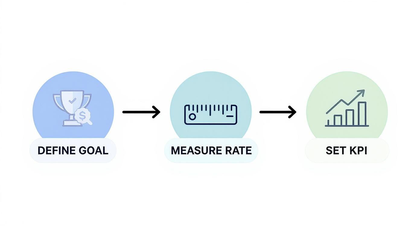
As you can see, defining your goal is the critical first step. Only then can you accurately measure your rate and set KPIs that make sense.
Calculate and Benchmark Your Current Rate
Figuring out your conversion rate is simple math. Just use this formula:
(Total Number of Conversions / Total Number of Visitors) x 100 = Conversion Rate %
So, if you had 500 visitors and made 10 sales, your conversion rate is 2%. That 2% is now your starting line. But is it any good? Well, that really depends on your industry. For a deeper dive into the nuances of CRO, it’s worth exploring guides on conversion rate optimization best practices to get a broader perspective.
Ecommerce Conversion Rate Benchmarks by Industry
A look at average conversion rates across different ecommerce sectors to help you set practical and informed goals.
While the global e-commerce average hovers around 2.9%, that number is pretty much useless without context. As the table shows, rates vary wildly. Beauty products can convert as high as 6.8%, while fashion often sits below 2%. This is why you have to benchmark against your specific vertical to set goals that are ambitious but achievable.
Key Takeaway: Your most important competitor in conversion optimization is your past self. While industry benchmarks provide context, the ultimate goal is to achieve consistent, incremental improvement over your own baseline month after month.
By establishing this clear, data-backed starting point, you turn CRO from a guessing game into a methodical science. Every test you run and every change you make can now be measured against a concrete baseline, ensuring your efforts lead to real, quantifiable growth.
Finding Where Your Visitors Get Stuck
To get more conversions, you first have to play detective. Your website analytics are a goldmine, full of clues pointing directly to where potential customers are getting frustrated and giving up. The trick is knowing how to read the signs and follow the trail of breadcrumbs.
This isn't about guesswork. It’s about using hard data to find the exact friction points in your customer’s journey. When you know where people get stuck, you can stop making random changes and start rolling out targeted fixes that actually solve their problems.
Start With the What: Dig Into Your Analytics
Your first stop should always be your analytics platform, like Google Analytics. This is where you'll find the quantitative data—the cold, hard numbers that tell you what's happening on your site. Don't let all the charts and reports overwhelm you; just zero in on a few critical ones that show where your funnel is leaking.
Start by hunting for pages with sky-high exit rates. If your pricing page has a 90% exit rate, that means nine out of ten people who look at your prices immediately leave your site. That’s a huge red flag. It could signal a problem with your pricing itself, a lack of clarity, or a major trust issue.
Another metric to watch is the average time on page. A product page where visitors only stick around for 10 seconds is a bad sign. It suggests people land, can't find what they need, and bail almost instantly.
Look for these patterns to build a shortlist of problem pages:
- High Exit Rates on make-or-break pages (think checkout, pricing, or contact forms).
- Low Time on Page for pages that really need a user's attention.
- High Bounce Rates on key landing pages. If you're struggling with this, our guide on building a high-performing local SEO landing page has some great, actionable tips.
This data gives you the "X" that marks the spot, but it doesn't tell you the whole story. For that, we need to dig deeper.
Uncover the Why With User Behavior Tools
Okay, so you know what's happening. Now it’s time to figure out why. This is where qualitative tools from platforms like Hotjar or Crazy Egg are invaluable. They show you how real people are interacting with your site, turning those abstract numbers into actual human behavior.
Heatmaps are fantastic for this. They generate a color-coded overlay on your pages showing where people click, move their mouse, and scroll. You might instantly see that everyone is clicking on a fancy image that looks like a button but isn't actually clickable. Talk about a dead end.
A heatmap can reveal that your most important call-to-action button is being completely ignored because it’s placed "below the fold," a part of the page 80% of your users never even scroll to. That one insight is worth more than a dozen different analytics reports.
Session recordings take it even further. These are literally just video replays of a user's entire visit. You can watch someone hesitate on the checkout page, see their mouse hover back and forth over two pricing tiers, or witness them "rage-clicking" a broken link over and over. Watching these builds a ton of empathy and gives you undeniable proof of what’s broken.
Pinpointing Your Top Conversion Killers
Once you combine the what from your analytics with the why from user behavior tools, you can build a prioritized hit list of conversion roadblocks. The goal is simple: find where high traffic meets poor performance. A bug on a page that gets ten visitors a month isn't your priority. A confusing form on a page that gets thousands of visitors? That’s an all-hands-on-deck situation.
I find it helps to organize everything in a simple table. This makes it easy to see what to tackle first.
This methodical approach takes the guesswork out of improving conversions. You now have an evidence-backed roadmap to fix the most impactful issues first and make sure your efforts are focused where they'll truly make a difference.
So, How Do You Run Tests That Actually Work?

You’ve done the hard work of finding the friction points on your site. Fantastic. Now it's time to stop guessing and start testing. This is the part where you separate the businesses that see steady growth from those just throwing changes at the wall and hoping something sticks. You're about to turn your website into a conversion lab.
The idea is really simple: you pit a new idea against what you currently have and let your users vote with their clicks. This completely removes ego and internal debates from the equation. Instead of arguing about whether a green or orange button looks better, you let the data tell you which one works better.
This mindset is everything when you want to improve your website conversion rate. It shifts your whole strategy from a series of gambles to a smart, structured process.
Understanding Your Testing Toolkit
Before you dive in, you need to know what tools you have at your disposal. Each type of test is built for a specific job, and picking the right one is half the battle.
A/B Testing (or Split Testing): This is your bread and butter. You create one variation of a page (Version B) and test it against the current one (Version A). Maybe you're testing a new headline. Traffic gets split down the middle, and the version that gets more conversions wins. Simple and effective.
Multivariate Testing (MVT): This is A/B testing's more complex cousin. Here, you test a bunch of changes all at once. For example, you could test two headlines, two images, and two button colors simultaneously. The software then figures out the best-performing combination of all those elements. It's powerful, but it needs a ton of traffic to get a clear winner.
Split URL Testing: This is what you use for the big stuff, like a major page redesign. Instead of just tweaking an element, you're sending traffic to two completely different URLs to see which layout or flow performs better.
For most marketers and small businesses, A/B testing is the perfect place to start. It's straightforward to set up, the results are easy to understand, and you don't need a massive audience to get actionable insights.
The One Thing Your Test Can't Live Without: A Hypothesis
Running a test without a solid hypothesis is like going on a road trip without a map—you're just burning gas. A good hypothesis is an educated, testable guess about what will happen and, most importantly, why. It connects something you saw in your research to a solution and a measurable outcome.
The formula is simple: "If I change [X], then [Y] will happen, because [Z]."
Let’s make this real. Say you noticed your product page has a disappointing add-to-cart rate. After watching some session recordings, you see people scrolling all over the place, seemingly looking for shipping costs.
A weak hypothesis would be: "Changing the shipping info will increase conversions."
A powerful hypothesis is: "If we move the shipping information directly below the price instead of hiding it in the footer, then the add-to-cart rate will increase, because users will see this crucial information immediately, reducing their hesitation."
See the difference? The second one is specific, measurable, and explains the why. This gives your test a real purpose and makes the results valuable, even if the test doesn't "win."
Setting Up and Running Your Experiment
With your hypothesis ready, it's time to get your hands dirty. Tools like Google Optimize, Optimizely, or VWO make the technical setup much easier than it used to be. The key is to be methodical.
Here’s a quick checklist to run through before you hit "launch":
- Nail Down Your Goal: What's the one metric that means success? Is it clicks on the "Add to Cart" button? Form sign-ups? Make sure your tool is tracking that specific conversion.
- Pick Your Audience: Are you showing this to everyone, or just new visitors? Only mobile users? Defining your audience makes your results much more relevant.
- Allocate Traffic: The standard practice is a 50/50 split. Half your audience sees the original page (the control), and the other half sees your new version (the variant).
- Decide How Long to Run It: This is so important. Don't call the test the minute one version pulls ahead. You need to let it run long enough to reach statistical significance—usually a 95% confidence level. This just means you can be 95% sure the result is real and not just a fluke.
One of the biggest rookie mistakes is ending a test too soon. You need to run it for at least a full business cycle—a week or two is a good starting point—to smooth out any weird daily spikes or dips. A B2B site might be dead on a Saturday, while an e-commerce store could see its biggest rush.
Stick to this process, and every test becomes a learning opportunity. When you win, your conversion rate goes up. When you lose, you still learn something valuable about what your audience doesn't want, which helps you form a smarter hypothesis for the next test.
Crafting Words That Drive Action
You can have a stunning website and a flawless checkout, but if your words don't resonate, you're not going to see conversions. Your messaging is the engine. It’s what turns a casual browser into someone who is genuinely excited to take the next step.
I've seen it time and time again: bad copy is the silent killer of conversion rates. It’s not a technical glitch you can easily pinpoint. It’s a fundamental failure to answer your visitor’s biggest question: “What’s in it for me?” Every single word on your site has a job to do—build trust, show value, and nudge the user toward the finish line.
Nail Your Value Proposition Immediately
When someone lands on your page, you have just a few seconds to prove they’re in the right place. Your value proposition is your elevator pitch, and it needs to be right there, front and center. It has to spell out what you do, who it’s for, and why you’re the best game in town.
Keep it simple. Seriously. Ditch the corporate jargon and buzzwords. If a first-time visitor can't get it in five seconds, they're gone. A great value proposition doesn't talk about you; it talks about the tangible outcome the customer gets.
Let’s take a project management tool, for example.
- Before (Vague): "Synergize your workflow with our innovative project management solutions."
- After (Clear & Benefit-Driven): "Stop juggling tabs and emails. Bring all your team’s tasks, projects, and files into one place. Finally get organized."
See the difference? The second one hits on a real pain point and promises a clear, desirable solution. That's the kind of clarity that actually boosts your website’s conversion rate.
Swap Vague Headlines for Benefit-Focused Hooks
Your headlines are the most valuable real estate on the page. While a clever, pun-filled headline might feel great to write, a clear, direct headline almost always wins. Think of your headlines as signposts, each one communicating a core benefit and pulling the reader further down the page.
Your focus should be less on what your product is and more on what it does for your customer. Frame every feature as a benefit. A "50GB storage" feature becomes "Never run out of space for your important files."
Key Insight: People don't buy products; they buy better versions of themselves. Your copy needs to paint a vivid picture of how their life or work will improve after they click that button. It’s all about transformation, not just a transaction.
For instance, a dental clinic selling cosmetic services could go with "Our Cosmetic Dentistry Services." It’s fine, but it’s boring. A much better headline would be, "Get a Smile You’re Proud to Show Off." The first describes a service; the second describes an emotional outcome. Which one do you think connects better?
Write Calls to Action That Command a Click
The call-to-action (CTA) button is the final gateway. Words like "Submit," "Download," or "Click Here" are lazy and completely uninspiring. They tell the user what they have to do, not what they're going to get.
Your CTA copy should feel like the natural conclusion of the conversation, reinforcing the value they're about to receive. It needs to be specific, action-oriented, and make the click feel like the obvious next step.
Here’s a quick breakdown of how to turn passive CTAs into powerful ones:
Notice how many of the better versions use first-person language like "My." This is a small but powerful psychological trick. It helps the user take mental ownership of the action, making them far more likely to follow through. By carefully crafting every word—from your big-picture value prop down to the final CTA—you build a persuasive journey that guides visitors right where you want them to go.
Building Trust to Overcome Hesitation
Every single person who lands on your site arrives with a bit of healthy skepticism. They’re looking for red flags, often without even realizing it. If something feels off, they’ll hit the back button and you’ll never know why they left. This is exactly why building trust isn't just a nice-to-have; it's one of the most powerful things you can do to improve your website conversion rate.

Trust signals are all those little cues—both visual and written—that tell visitors your business is legit, your products are solid, and their information is safe with you. They work by chipping away at that initial hesitation, making it much easier for a customer to finally say "yes."
Showcase Authentic Social Proof
Let's be honest: people trust other people more than they trust marketing copy. That’s why social proof is your single most powerful trust-builder. Seeing that others have bought from you and had a good experience instantly lowers their guard. In fact, a huge part of getting customers over the line is building trust through online reviews, as they provide that crucial third-party validation.
Here are a few ways I’ve seen this work wonders:
- Customer Reviews & Star Ratings: Get these right on your product pages. One study showed that products with reviews get a 12.5% bump in conversions. And don't be afraid of less-than-perfect reviews! A mix of 4- and 5-star ratings actually feels more authentic than a page of nothing but flawless praise.
- Video Testimonials: A simple, 60-second video of a happy customer can be pure gold. It puts a real face and voice to the feedback, making it feel so much more genuine than text on a screen.
- User-Generated Content: Encourage your customers to share photos of themselves using your products. When you feature those images on your site, you’re showing your product in the real world, which builds incredible credibility.
Display Visible Security and Guarantees
As someone gets closer to checkout, their security radar goes on high alert. They're about to type in their credit card details, and they need to feel 100% safe.
Pro Tip: The checkout page is the most critical place for trust signals. So many carts are abandoned at the last second because of a sudden worry about security or hidden fees. Reassure them right when it matters most.
Make your security measures and guarantees impossible to ignore.
- Security Badges: Logos from familiar names like Norton, McAfee, or even your SSL provider are instant visual shortcuts that say, "This site is secure."
- Clear Return Policy: Don’t make people hunt for your return policy in the footer. A simple icon and text like "30-Day Money-Back Guarantee" placed right under the "Add to Cart" button can remove a huge amount of perceived risk.
- Accepted Payment Logos: Showing the logos for Visa, Mastercard, and PayPal might seem small, but it adds a layer of professionalism and familiarity that subconsciously builds confidence.
Address Objections Proactively With an FAQ
A great FAQ page is more than just a list of questions—it's a conversion tool in disguise. It’s your chance to get ahead of the most common sales objections and dismantle them before they can kill a sale.
Think about the top three reasons someone might hesitate—maybe it's about shipping costs, product quality, or data privacy—and address them head-on. A thoughtfully written FAQ can turn a visitor's doubt into confidence. For a deeper dive, our guide on creating an effective FAQ for your website explores how to turn this page into a real asset.
By weaving these trust elements throughout your site, you create an environment that calms anxiety and supports the user. You're not just selling a product; you're building a relationship based on transparency and reliability.
Got Questions About Conversion Rates? We've Got Answers

Once you start digging into CRO, you’ll find that a few key questions pop up again and again. It’s totally normal. Getting a handle on these common sticking points is the key to making real progress without getting bogged down in theory.
Let's clear the air and tackle some of the most frequent questions I hear from marketers and business owners.
How Long Should I Run an A/B Test?
This is a big one, and the answer isn't about a set number of days—it’s all about traffic. The goal is to reach statistical significance, which is a fancy way of saying you have at least 95% confidence that your results are real and not just a random coincidence.
A high-traffic e-commerce site might see a clear winner in just a few days. But for a B2B site with lower, more targeted traffic, you might need to let the test run for a month or even longer to get enough data.
As a solid rule of thumb, always run a test for at least one full business cycle (usually a week) to account for weekday vs. weekend behavior. Most testing tools will tell you when you've reached a statistically valid conclusion.
What’s a “Good” Conversion Rate to Aim For?
Honestly, there's no magic number. While you'll often hear that the average e-commerce site converts at around 2-3%, that number is almost meaningless without context. It all depends on your industry, price point, and what you’re asking the user to do.
Think about it this way:
- A high-ticket service selling $10,000 consulting packages would be thrilled with a 0.5% conversion rate.
- A simple lead magnet, like a free e-book download, could easily aim for a 20% conversion rate.
Your best bet is to find your industry’s benchmark to get a feel for the landscape, but then immediately shift your focus to beating your own numbers. The real goal is steady, incremental improvement, not hitting some arbitrary industry average.
Is It Better to Make Small Tweaks or Do a Big Redesign?
For nearly everyone, the answer is small, iterative tweaks. A full-scale redesign is a massive, all-or-nothing gamble. If your conversions tank after launch, you'll have no idea which of the dozens of changes you made caused the problem.
Testing small, focused changes gives you clear, actionable feedback. You can isolate variables by testing things like:
- A new headline
- A different call-to-action button color
- Adding a specific testimonial next to the "Buy Now" button
This methodical approach lets you learn something from every single experiment, win or lose. Over time, these small, validated improvements stack up to create huge gains—all without the terrifying risk of a costly redesign failure.
Ready to answer your customers' real questions and boost conversions? Faqir is an AI assistant that finds what your customers are asking in calls and emails, then turns those insights into a powerful, conversion-focused FAQ for your website. Help buyers make decisions faster by visiting https://www.faqir.ai.